Edit: Guys, I'm sorry but I made an error which has now been corrected in my post. There is not a 10 x 12 insert, it's an 8 x 12 insert which was cut down from a Project Life Z page protector.
Just finished Week 40 of my 2014 Project Life. Instead of stressing about behind behind and getting caught up, I'm totally embracing my new simple outlook and getting more of the stories told. It's a new challenge to see what kind of a total package I can pull together for a weekly spread. This week was just a joy to create. Hang with me, lots of photos but I'll keep the chit chat to a minimum.
For Week 40 I've got a two page spread plus two inserts. All inserts were printed from One Little Bird.
Here's what the two page spread looks like with no inserts.
The left page was just random photos from the week with a single journaling card acting as a week in review.
The right page is all dedicated to Jordan's 16th birthday.
For my week number card I used a One Little Bird digital overlay and added the date. I used Dropbox to import the overlay into the LetterGlow app.
This is the weekly spread with the front of an 8" x 12"insert cut down from a 12 x 12 Project Life Z Page Protector. The photos were just more random photos from the week but they were all of nature so I collaged them together on one page.
Here's a closeup of that insert.
Turning the page you can see the back side of the 8" x 12" insert. You can also see another 5" x 7" insert on the right side.
Here's the two pages together. These two inserts coordinate with one another.
I copied a blog post into a word document and printed it at 4 x 6 size. Title is cut from a One Little Bird journaling card and leaf is from Gossamer Blue's Gramercy Road collection. Boy, Ali Edwards hits it right on the money when she uses her blog posts for journaling. I think I'm going to start adding more stories to my blog so I can do the same. So easy to get a full story instead of trying to do it when you're assembling layouts.
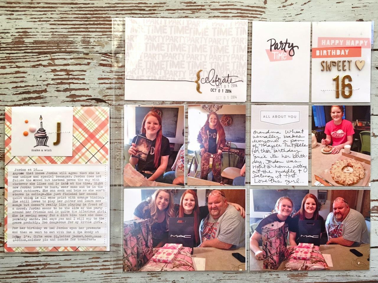
Turning the page again, you can see the back side of the 5 x 7 insert.
This insert coordinates with the 12 x 12 page of Jordan's birthday.
Patterned background is from a Gossamer Blue kit. Cake piece is from a One Little Bird journaling card. Embellishments and lined journaling card are from Gossamer Blue kits and shop.
Here's some of the One Little Bird journaling cards I used for Jordan's birthday. Gosh, I love them so. Simple, not too much color, lots of white space. Just the look I'm going for this year.
Wood veneer is from Studio Calico and gold letters are from a Gossamer Blue kit, from American Crafts.


6 comments:
Another lovely PL spread and love the added inserts. Turning 16 is a very special milestone and it looks like your daughter had a great time and looks you did a great job documenting that special day. I really love seeing your handwriting for the journaling and love your idea of using blog posts for some of the journaling! May have to try that myself!
Hugs,
Jo
xox
Love your new approach to PL. I'm doing much the same this year and love how it looks. Also a fan of One Little Bird.
Thanks for sharing! Where did you find the 10x12 page protectors?
Thank you for inspiring me! xo, Marian
Love, love, love!! So very inspired!!
Ha ha! Thanks for the update on the Design Z page protector. I kept looking at the image...doing the math and it just did not add up to 10 x 12. I really like the look of the insert. Did you buy Design Z in an assortment pack? Thanks again!
Post a Comment