February 15, 2014

Project Life 2014...Week 2 using Gossamer Blue Life Pages Main Kit

Today I'm sharing my Project Life Week 2 spread with you.  I've got a fun post up over at the Gossamer Blue blog today which goes into detail about getting the most out of your Life Pages kits.  You can scroll though my photos in that post to see how I added details to make my pages more interesting.  

Here's the full two page spread for Week 2.
The left side....
The right side.....
Lots of details on my weekly, dated 4 x 6 insert.
Gossamer Blue's exclusive veneers...
Here I created a flipper insert by using two 3 x 4 journaling cards and a photo.  
The photo flips up to reveal some typed journaling.  I also used the February stamps on the journaling card. 
Punched grid paper from a 4 x 6 card makes for some great journaling spots.  I typed my journaling first then punched the shapes. Check out that cool basketball that Jordan helped create for the Queen of Courts ceremony. 
I'm loving the workspace photos lately.  Shows a little peek into what I do. 
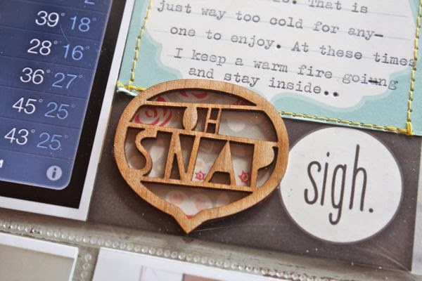
Well...he is.  Use stickers, wood veneer and die cut shapes to fill in some blank areas of photos.
Love when the family takes photos.  Here I was photo bombed by Jordan while shuffling cards.  Some of my favorite photos.  Over at the Gossamer Blue post I discuss how to add interest to stamped images.  Here I used the interactive stamps from the Life Pages Kit from February.
Stitching...always a favorite for me.
More stitching...and typed sentiments.
I'm trucking right along with my 2014 Project Life.  Still loving the process.  I'm changing things up just a bit and I'll share those ideas in future Project Life posts.  

Gossamer Blue March sneak peeks:  
I've got some peeks of my favorite products from each kit over in the Gossamer Blue forums. Kits sold out rather quickly last month and Lori has made some stellar selections for March too...so it's a great time to get first dibs and start a subscription to a kit.  March kits go on sale March 1st.  Stay tuned for some peeks at my finished projects soon.  

February 14, 2014

February Inspiration Board...Wood You Be Mine?

This year I started a monthly series of inspiration boards over at my Pinterest site.  Each month I'll select a group of images that I've collected from my various Pinterest boards and use them as inspiration on a whole new board.  February's inspiration board is called Wood You Be Mine?  

I was inspired to create this board after seeing this image below.  It reminded me of all the Aspen trees we saw in Colorado last Summer while riding our Gator on some mountain trails.  We'd see carvings on trees just like this.  Although we wouldn't let the girls carve their initials on any trees, I did find the carvings endearing.  So fast forward to February and I thought that hearts and woodgrain would make a perfect pairing.  

Since so many of us pin a lot of inspiring photos from Pinterest I wanted to share how I actually use the photos to jump start an actual project.  I know....actually creating something from a Pinterest pin...novel idea, right?  

Here's a few photos that I pulled from my February board and how I might use them on a project.  I loved this handmade bag photo and have admired it for some time.  To convert the idea to a paper project I like the idea of using the design for a card front.  I could use woodgrain paper and maybe a few other patterned papers to create a striped background layer.  Then I could use layers of other papers, maybe a ledger paper, and some stitching to finish off my card.  I like the idea of the neutral backgrounds and maybe I could create a whole stack of those to use on cards anytime. 

From this photo I was simply inspired to use more ribbons on a project.  I'm giving ribbons a comeback this year on my projects and this is a fun reminder that there are lots of fun ribbons just waiting for me in my stash.  The neutral background could easily be switched out with a woodgrain pattern.  Love the color inspiration from this photo also....minty greens, salmon and the neutrals.  

From this photo, I'm combining two recent loves....hand lettering and floral clusters.  I'd love to just print this photo off for inspiration then get to work on practicing my hand lettering.  Then I'd love to make some hand lettered card fronts then stamp on some little floral clusters...maybe adding some hand painted floral elements into the mix.  Sometimes I  really like the idea of the stationery look with flat layers as a contrast to heavily layered cards. 

I hope I've inspired you today to select a photo from my Wood You Be Mine? Pinterest inspiration board and create something special. The inspiration is plentiful, we just need to put it into action.  I'll be keeping all of my monthly inspiration boards active so they'll be at my Pinterest site from month to month for 2014. 

Happy Valentine's Day to you all!  Hope your day is lovely.  We celebrated with a wonderful dinner and little gifts last night....tonight we'll be watching the girls play basketball and will have hotdogs from the concession stand.  :) Looking forward to a relaxing weekend with warmer temperatures after tonight.  

Note: I will be still be posting my December Memories remaining pages.  Please don't let my last few unseen pages stop you from working on your album though.  I'm not quite sure when I'll get to posting all of the remaining pages but they'll trickle in here on the blog sooner or later.  :)

February 12, 2014

Workspace Wednesday...Creating Your Own Watercolor Palette

It's Workspace Wednesday time and today I'm sharing how I created my own watercolor palette. I've had these photos since September when I first set up my watercolor palette but I never knew just when or where to share them.  My Workspace Wednesday seems like just the right spot.  

The reason I wanted to create a watercolor palette of this variety is because I wanted lots of colors, I wanted to be able to refill colors when they ran low, I wanted to be able to custom mix colors right onto a palette and I wanted something that was fairly small and easy to fold up and store or take with me on my travels if I wish. 
I researched and googled and looked through tons of photos on Pinterest and I finally found the system I wanted to try.  First up was the paints.  Although Winsor & Newton watercolors were far and above the preference for good quality from most of my research, it's all about personal preference.  I might just add, I'm not a watercolor artist...I'm just someone who likes to dabble with watercolors and maybe someday I'll hone my skills enough to get back into some landscape painting like I did in my high school and college days.  

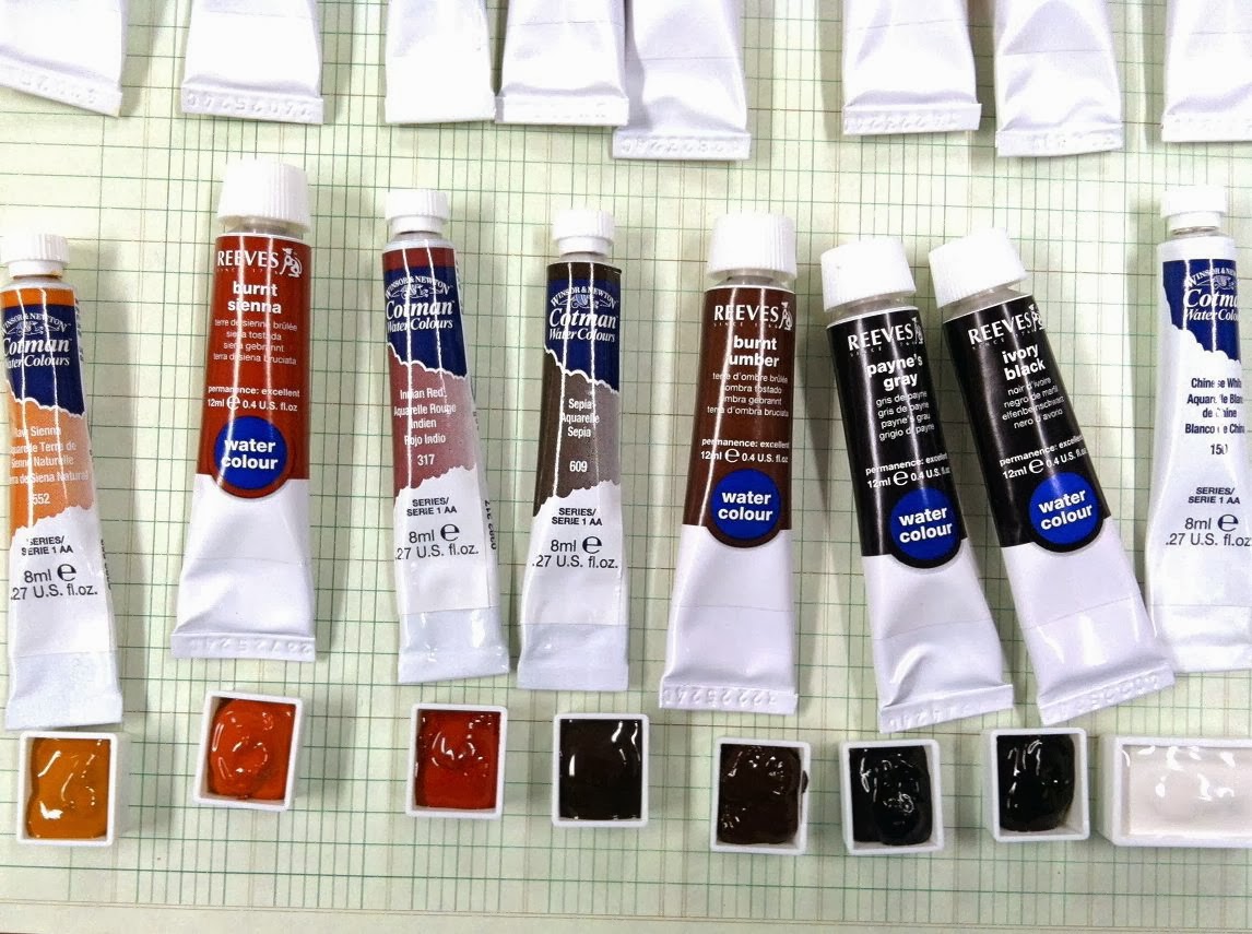
For my watercolor paints, I chose some inexpensive tube paints by Reeves and some from Cotman paints which are from the makers of Winsor & Newton.  The Cotman paints are less expensive and include both traditional pigments and reliable synthetic colors that replace some of the more rare and expensive pigments used in the artist grade Winsor & Newton paints.  I have since picked up some Winsor & Newton colors and a set of gouache paints to try out.  Here's the color palette that I started with, a rainbow variety.
Next up was choosing a watercolor palette.  When I first came across these aluminum, empty watercolor boxes my heart skipped a beat.  It was like a makeup compact for paints and refillable compartments.  The little organizer in me was a happy camper.  The particular palette I purchased was the Kremer Watercolor Box. It holds 28 full pans or approximately 50 half pans of tube watercolor paint. If I remember correctly this shipped from the UK and took about a month to arrive.  I was originally wanted this Schminke Watercolor Box but it's out of stock all the time.  I am very happy with my Kremer box and it was less expensive too.  
Okay, so you're asking what the big deal is with these watercolor palettes...or travel watercolor palettes as many call them.  The palettes come in lots of different sizes which means the bigger the palette, the more pans they hold.  So what are pans, you ask?  Pans are the plastic containers which hold the tube paints.  My particular palette holds almost 50 half pans which are the little square containers.  This means you can add 50 colors of paint.  A full pan is the rectangle container which is twice the size of the square pans.  So it holds twice the paint in one container but less of them fit in a palette.  My palette holds about 28 full pans.  These are sold separately from the palette. 
Once filled, the pans snap into the metal rows as you can see below.  They are held snugly in place by those metal "teeth" so that they don't move around while painting or traveling with the paints. The other great thing you'll see below is that the paint palette has two fold out trays with wells.  These are for mixing the paints and creating custom colors.  You can also squeeze out paint directly onto these areas and leave them there to dry for even more little palette areas.  When done painting you can leave the mixing areas with the paint in them and just keep re-wetting those areas. I prefer to clean up my palette each time since I never know what colors I'll use next.  
On to filling the palette.  You can see the photo above with all my tubes of paint lined up in rainbow fashion.  This is how I chose to put the filled pans of paint into my palette.  I grouped together browns and blacks....
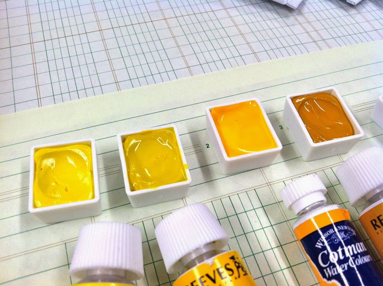
Here I have yellows, oranges and some reds....
Then purples, blues and more reds that carried over from the photo above...
Greens and blues.....
Then it was time to fill the plans.  This was such a fun process, just surrounding myself with art supplies again.  It's been a while since I lugged my art box and t-square across campus.  To fill a pan you simple squeeze the paint into the pan.  I would suggest filling the pan even more than what I have shown in the post.  They shrink down a bit and tend to crack....and I think if I had more paint in the pan originally that maybe I could have prevented that.  
Here's some of the pans all filled.  Oh..pretty.
I read a tip through my research about creating a well in the paint pan before the paints totally dried.  This created a dip in the paints so that when you added water to moisten the paints, it would not seep over the sides.  It was a good tip indeed. To do this you let the paints dry til a little film forms over the paint...but don't let them dry completely.  Maybe a few hours for this part.Then I just had a glass of water and some paper towels handy and dipped my pinky fingertip into the water...then pressed it into the filled paint pan.  The water helps the paint not stick to your finger so much.  Clean between paints and repeat the process. 
You can see a closeup of what the well looks like here.
Then you just let all the paints dry.  Mine took several days and I just left my palette open on a safe surface.  
I also used a fine tip Sharpie marker to label the brand and color onto each filled pan.  Another good tip I found online. 
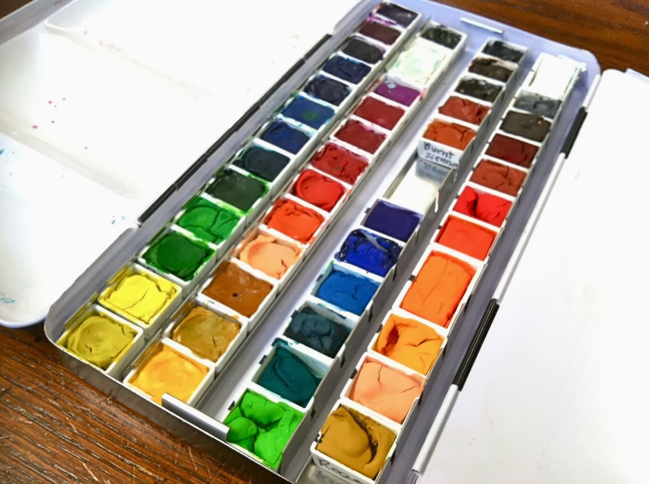
Here is my lovely little palette filled with all the colors I had at this time.  You can see that in the middle there is a space for a brush. I saw that some artists keep little sponges in some of the spaces and some keep pencils, small erasers and other supplies they need while painting. 
Right before my paints all dried is when they looked their best. 
This is what my paint palette looks like today.  I've added some more watercolor colors and some gouache colors to my palette since.  You can see that some cracking happened.  This doesn't affect the paints at all.  I added some paints back in to fill the pans a little and that did help somewhat. 
Okay, still with me? Here's a photo of my paints in action.  I find that I can easily pull out my watercolor palette for even the smallest of jobs.  On this day I was working on some flowers for cards.  I mixed up the coordinating colors and could easily have my palette and a tin of water nearby without taking up too much space. 
If I want to work on bigger jobs, I've found that these enamel coated lids that fit on vintage refrigerator boxes, baking pans or perhaps medical tool trays work wonders.  Another tip from Pinterest. Here I was actually using paints from the tube with a shimmer medium.  
Another larger job using Hero Arts Daubers with lots of water.  These enamel lids clean up wonderfully. 
Here are just a few of the ways I've used watercolors.  I'm using them mostly for cards and packaging and tags, etc right now.  Someday I will be brave enough to paint that landscape.  Until then here's a fun packaging idea from this kit
Some watercolor wash I did in the colors of the rainbow for a card.
These pretty little sentiment pieces with flowing watercolors.  I loved these.
Finally I'd like to share some of my inspiration for my watercolors.  I have two Pinterest boards that I visit often for ideas and just to gaze and get lost in inspiration sometimes.  The first board is my Art Studio board where I have lots of photos of watercolor palettes, paint brushes, studios...the photos that just make you happy to look at.  The other board is my Watercolor Inspiration board where I have pinned photos of actual watercolor paintings, tutorials, techniques, etc.  These are my "some day I will paint like this" board. 
(photo inspiration from my Pinterest boards

I hope you are inspired to try using watercolors in your work.  Don't be intimidated, just start.  Just pick up the brush and make some puddles of color.  It's so fun to just dabble.  It doesn't have to be perfect. It doesn't even have to make it to an actual project.  The process is just as important as the finished product.  Hope you enjoy.  

February 9, 2014

Get Well Soon Cards....shopping your stash for project inspiration

Today I'm sharing some get well cards that I needed for my stash.  I want to share a few thoughts about pulling together inspiration for a project by selecting items from your built up supply of crafty goodies.  A lot of times I say that "I shop my stash" and it's so true.  Digging back through your collection of supplies is almost as fun as shopping for new items.  Let me walk you through how I shopped my stash for this set of cards. 

First, I knew I wanted some get well cards.  I knew that this pretty set from Avery Elle called Petals and Stems had a new get well sentiment that I hadn't yet stamped.  So I set out that stamp on my work table. I thought the flowers and coordinating Die: Petals & Stems Elle-ments dies would be fitting for get well cards too so now the entire stamp set would be put to use + some coordinating dies.  
I often like to pair up stamp sentiments from different stamp sets.  The "just a note" sentiment has a beautiful script look to it and is a little bit bigger than the "get well" sentiment.  That stamp is from a Studio Calico stamp set but I can't find the name of it or a link to a photo of the set anywhere.  I'm pretty sure it's sold out....but it's the set with the eye glasses and library books.

Next up from my stash I wanted to select some patterned paper so I could select a color scheme for my card.  The floral paper and the aqua polka dot paper are both from the Gossamer Blue February Bits & Pieces Kit. I often like to go mixy matchy with my patterned papers and these two just looked so pretty together.
From that point I was ready to create my cards.  I used watercolors and gouache paints from my art cart to create the muted, die cut flowers.
Next, I added finishing details to my cards like the gold stitching between the sentiments, the two enamel dots, the dimensional flower and the messy nest of string that I collected from my sewing machine area.

I ended up creating a little gift item for an older friend/former teacher.  She had just had surgery and Eric always picks her up for their school board meetings since she doesn't drive well at night.  I wrote a nice message inside the card, packaged up some of my spiced hot tea mix & added a quick typed tag with Washi tape, then inserted them both into a white paper sack.  Tags and sacks are always, always items that I keep in my stash.  You can find lots of varieties in my shop at all times.
I must add that our friend just loved the gesture of a card and a little gift.  It feels SO good to give from the heart, especially when it's handmade and homemade goodies.  I hope you're inspired to shop your stash...get mixy matchy with your crafty supplies...and create something special for someone.  Valentine's Day is coming up with week.  For inspiration, check out my February Pinterest Inspiration Board.

February 5, 2014

Workspace Wednesday.....Vintage Typewriter

I am so excited for today's Workspace Wednesday post.  I've gotten great response to this new blog series and today I'm featuring one of my favorite scrapbooking tools ever.....and it's something I've gotten tons of emails about.  Let's not hesitate, here's my vintage typewriter:
Isn't she a beauty? You all know I love vintage finds and this one was quite the score.  That I'm able to use it every time I work on a project just makes me all the more happy.  
Here's the details that I know about my typewriter:

Make and Model: 
My typewriter is an Olivetti Underwood Studio 44 manufactured in 1965. There's a great review about this model at this link.  Part of the review says this:"At first glance, you notice the size. For a portable typewriter, it’s rather large. But once you get it on the desk, the sleek lines make it appear more accessible. Olivetti’s are known for their great curves and design. The Studio 44 is no exception. Even the name “studio” suggests an artist at work. This is not your standard office typewriter, but it has the solid mechanicals required for doing work, lots of work."

Manufactured:
Hispano Olivetti Plant in Barcelona, Spain.  Here's another fun article from an Olivetti collector, with a fun photo of the typewriters in a showroom in Italy.  The article says, "Designed by Italian architect Marcello Nizzoli in collaboration with engineer Guiseppe Beccio, the Studio 44's special feel, a perfectly calibrated "resistance" that marks the typing action; not to mention a stability that's close to what you'd get from a standard, are qualities that are pretty hard to beat.  And as an exemplar of Nizzoli's architectural/sculptural stylistic signature, the Studio 44 is a remarkable mod design statement."

I took the photo below of the inside of my typewriter case.  Mine came with the original manual and it's so graphically detailed.  You can tell that an architect designed it. 
Price Point:
This is a hard one because you never know where a typewriter might pop up.  You  might find one at a garage sale for $10 bucks.  A friend called me from a Good Will store and after I said, "Yes I want it!", she paid under $15 bucks for mine, in mint condition.  I see them on Etsy and Ebay starting at $100 or more.  My best advice is to scour the thrift shops often and check online sites every week if you are in the market. Be sure to inquire or test the keys.  I would insist that every key work and not stick if you're looking to use the typewriter for actual typing.  Or make sure that the imperfections can be fixed for a reasonable price by someone who works on them. 

Replacement Ribbons:
Before I knew that vintage typewriter ribbons could be purchased online, I took my ribbon spools to a local office supply store.  When I got them home, the new ribbon spools didn't fit.  So I unwound the old ribbon and wound the new ribbon onto the old spools. A few inky fingers but it worked.  I've used that spool for about 2 years now and am finding I need a replacement.  A quick google search with the make and model of your typewriter will hook you up with lots of results.  I've seen the ribbon I need for less than $10 bucks.  

Now for the fun stuff.  I use my vintage typewriter to do a lot of my journaling for my Project Life.  

Here's some of the products I use, below.

All kinds of labels:
Grid Paper Labels and Notebook Paper Labels are my most used items because they fit easily into my typewriter and are sticky on the back.  I type my journaling then stick them onto my Project Life inserts or photos. I also carry Grid Paper US Map Labels, Notebook Paper Quote Bubble Labels, Grid Paper Arrow Labels, Starburst Grid Paper Labels and Notebook Paper Heart Labels.  You can find them all in my shop
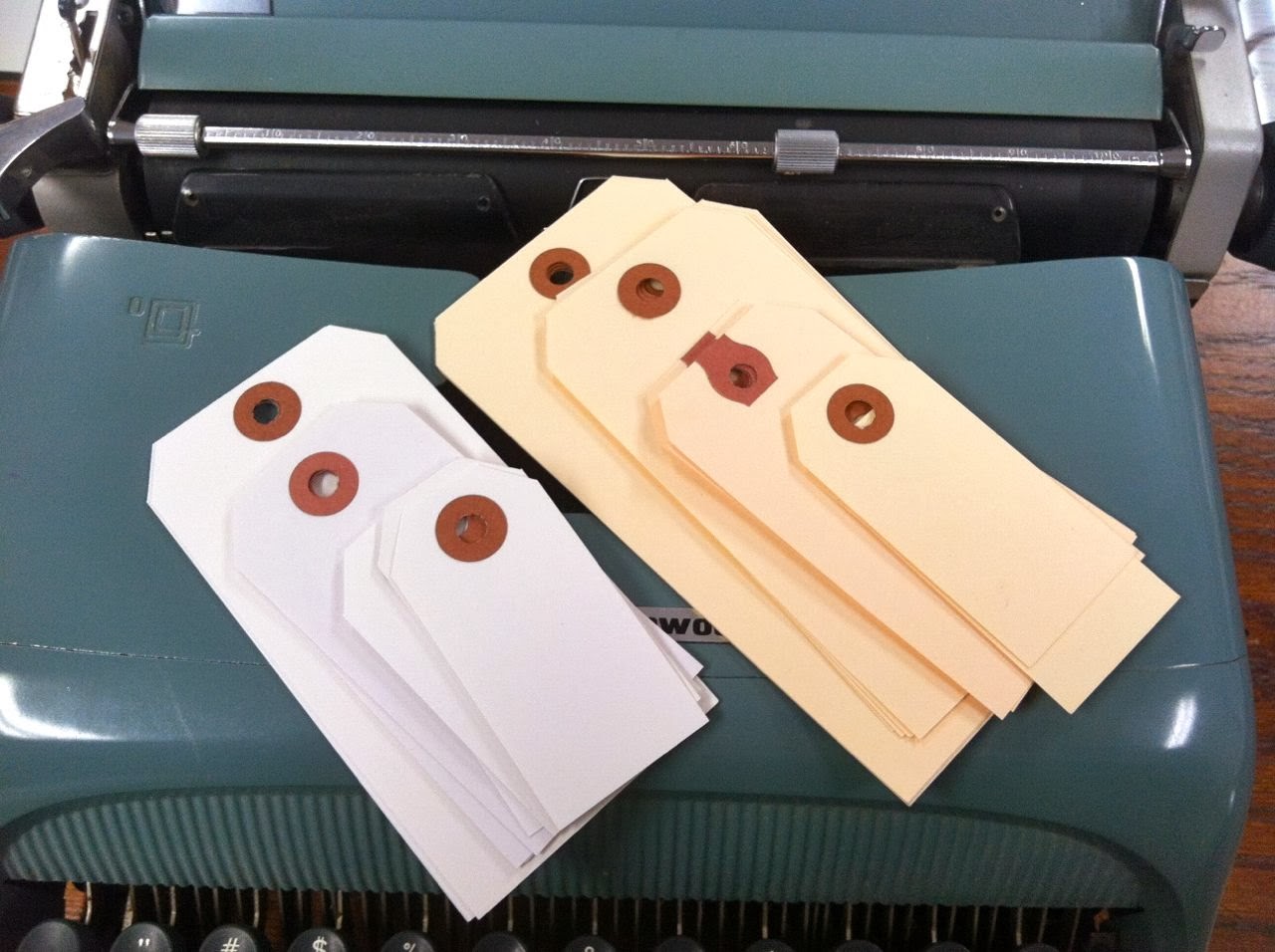
All colors and shapes of tags:
Tags are another staple item that I keep handy for my Project Life, cards and gift wrap.  Some of my most used tags are the Medium Manila Parcel Tags and Small White Parcel Tags. I carry lots of sizes int the white and manila tags + I stock a Small Kraft Tag, Small and Medium Gray Parcel Tags and some speciality tag in smaller sizes.  These are all available in my shop as well.
Journaling cards:
Of course I love to use all kinds of 3 x 4 and 4 x 6 journaling cards in my vintage typewriter. Because my handwriting is rather large and loopy, I like to use typewriter journaling because I can tell more of the story due to the smaller typewriter font. I think it looks clean with just a hint of vintage too.  I have a whole stash of journaling cards from various companies.  I design for Gossamer Blue and you can find some of their cards from various kits at this link. I recently helped with the concept design for Gossamer Blue's new Basics Journaling Cards.  Neutral colors with fun lines, grids, dots, ledger patterns, etc. You definitely need these in your stash for Project Life.  I also use them as a fun layer on greeting cards.
How about seeing some of the typewriter journaling in action?  Here's a fun group of photos I compiled that show examples of my typewriter journaling + products I discussed.  

For those that love Instagram or square photos, the Grid Paper Labels fit perfectly below them.  
Here I placed a Notebook Paper Label with typewriter journaling + a date stamp directly onto my photo.  
Here I divided one label to use on two separate photos, in two separate photo slots.  
I used a Grid Paper Label over a photo with some stamping overlapping my journaling.
Here's one of the fun shape labels I offer, the Grid Paper Arrow Label.  If you leave some blank space when you take photos, the labels fit in perfectly.
Perfect for a Valentine themed week, I used a Notebook Paper Heart Label layered with a sticker and enamel dots. 
On to the tags, I used a Medium Manila Parcel tag here with typed journaling + various stickers.  This was stitched on a 3 x 4 journaling card for my 2013 December Memories album. 
Here I used an XL Manila Parcel Tag to fit right into a 3 x 4 journaling slot.  I just trimmed some length off the card, typed my journaling and added a square photo.
A Small Manila Parcel Tag was used on a photo with typed journaling, a date stamp + a piece of a sticker border stamp.  Love this, gosh I need to revisit my past Project Life pages.  I'm finding oodles of inspiration by just going through my albums.
Here was something fun I did with a collage of three photos onto one 4 x 6 sheet of photo paper.  I used the blank area to staple on a Small Gray Parcel Tag with typed journaling + a date stamp.
I love creating a main, dated 4 x 6 insert for my Project Life weeks.  This was a creative one I did with the addition of a "week in review" tag, using a Medium Manila Parcel Tag. Need to do this again because I LOVE it.
Let's not forget good ol' journaling cards of all kinds.  I like ones with lots of blank space because I tend to write a small story of journaling instead of just the who, what, where when.  You can see a little snippet of a Small Manila Parcel Tag stitched to the top too.  You don't have to use the entire tag.  Tuck them in behind photos, trim them down, cut in half..it's all good....and creative too.
Here's a beautiful example of the vintage typewriter journaling.  I love that you can slip a card into the typewriter and you can see right where you are typing.  If I tried to do this on my computer and run it through my printer, it would be one hot mess....and a ruined journaling card most likely.  You'll see the weekly spread that this card belongs to very soon on the blog. 
One more thing...I love to use my typewriter now for easy card and gift packaging sentiments.  It's so easy to slip in scrap cardstock and just type away.  Instead of just the plain "Happy Birthday" sentiment, I can totally get wild and crazy and type something like "Geez Dude, you're getting up there".  People always love those kinds of cards.  Below, I was tame and just typed "Happy Valentines Day".
So that's what I know about vintage typewriters.  I've had lots of emails and questions since I started using my vintage typewriter.  Now's your time to ask questions...I'll update this post with questions and answers.  

Oh, I almost forgot about these...Mini Typewriter Instagrams with "clickety clack clack" sentiments on them.  Fun for cards, packaging, etc.  They were inspired by my daugher Josey.  She heard me typing away one day and yelled downstairs, "clickety clack clack".  She knows how much I enjoy typing away on my typewriter.  I hope you enjoyed today's Workspace Wednesday.  Feel free to link up your workspace in the comments or on Twitter using #workspacewednesday or #hfworkspacewednesday for Marcy Penner's tweets. 
Related Posts with Thumbnails