So here we go on the tutorial. I'm using Karen Lockhart's cute Scarecrow stamp. The detail is small so this tutorial is about coloring smaller, multi color areas. You will learn lots of different coloring techniques so you might want to take notes. I hope you enjoy!
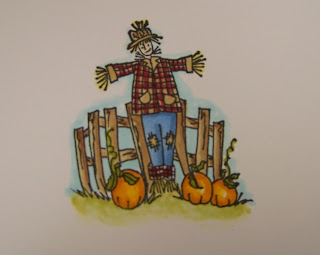
Okay, so I've got my image stamped, heat set and ready to go. I'll start with the pumpkins first. This technique is done by blending similar colors together on the paper. I start off by coloring my pumpkins in with a light color yellow/orangy marker. Always leave a white space when coloring objects that have dimension. This will give the effect of highlight or a light spot.
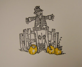 Next I color the outer areas of the pumpkin in with a darker orange color. You now will see three colors basically on the pumpkin: white, light orange, dark orange.
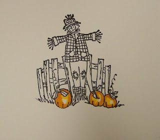 Next I take my lighter orange color and color over the darker area to blend the two oranges together. Any marker can act as a blender pen. Just remember to use the lighter color over the darker color to blend the two together. I still left hints of those white spots for a nice highlight.
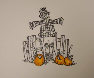 I colored the pumpkin stems in green and they are done. Next I move to the fence. For this coloring technique, I colored the fence planks in with a tan marker all over.
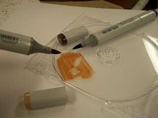
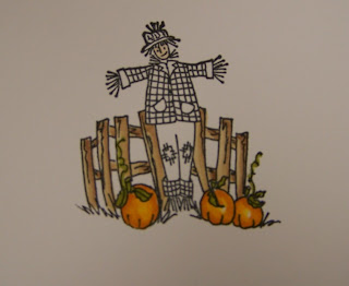 I then took a darker brown marker and scribbled some ink onto a CD case. Lay the CD case over the color of the paper you are coloring on so that you can get a good idea of what the colors will be. Then I took my tan marker that I colored the fence in with and picked up some of the dark brown color off of the CD case. Just like using a paint brush to pick up paint medium. I used this to shade in the darker brown on the fence planks. See photo above. Notice that I paid attention to my shadows and that all of the shadows on the fence fall to the right. This means that my light source is coming from the left. Lighter on the left where the sun might be shining and darker on the right where the shadow is. You can pick up more color as needed from the CD case. If it's too dark, you can scribble a little off on some scrap paper. Clean the tan marker when done cleaning to remove the darker brown ink. My tan marker is now back to it's original color.
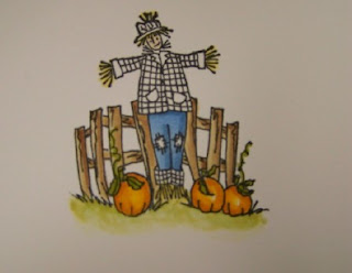
 Next I colored in the scarecrows pants. I wanted him to be wearing some old farmer's jeans so I colored them a denim blue color. I simply colored them in solid then went back over the areas I wanted to be shaded with the same color marker. I love that you can use one color of marker to get darker shades. Just keep applying layers until you get the desired shadow. Notice again that my shadow falls to the right and a little bit under his shirt.
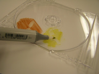
 Then I moved onto the grass under the pumpkins. I once again scribbled a green color (looks yellow in the photo) onto the CD case. Then I took my Colorless Blender (same type of sketch marker but it just has clear ink) and picked up some of the green color. I color directly onto my image with the blender pen and kept adding color til I got the look I wanted. I then wiped my Blender Pen clean onto a scrap piece of paper then continued to blend the grass out. See above photo.
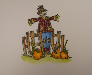
 Next I colored the scarecrow's shirt. Of course he had to have an old flannel plaid shirt, right? So I colored the burgundy stripes of the shirt following the lines on the image. Then I went in with the same color tan that I used on the fence and colored in the entire shirt. I went over the plaid lines to soften the look of the burgundy marker a bit. I also colored in the face, hat and straw hands and feet with markers. Lookin' good, Mr. Scarecrow!
 Now this is what really finishes off the colored image, in my opinion. I gave the image some depth by adding in a colored sky. Take a look at the photo above compared to the photo below. Doesn't the blue sky just make all the colors pop off the page. I thought so too! I do this with a lot of colored images just to get this cool effect. You don't have to color in an elaborate sunset or a whole sky either. Just a hint will do. To do this, I usually use a B00 or a B000 and simple outline around the colored image and in this case I colored in the spaces between the fence too. Let this set for a minute so you can see what the color ends up looking like. Then I take the beloved Colorless Blender and just blend the blue color into the white, fading it out so that there are no definite lines. Voila, now my image is finished! You likey?
 Here is the finished card I made. I took my colored image and die cut and embossed it using the Wizard and a Spellbinder's Scallop Square Die Template. No extra matting was needed because the image stands out so nicely. For the card base, I used a Memory Box notecard and four pieces of Rubber Soul patterned papers from the Garden Variety 8 x 8 collection. I added some twinkle sequins to some flower centers for a little bling. A cute polkadot ribbon finishes off the card. I hope you learn a LOT from my tutorials, I am more than happy to do them. I just love these Copic Markers so much and I want you to be able to use them and get the desired look you want. So have fun and let me know if you are a Copic addict like me!! Ellen has markers back in stock but they are selling out as soon as she can get them in. So place your orders today, don't forget the Colorless Blender and have fun!!
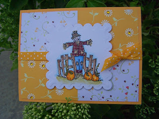
Tip of the day: To create the patchwork design on the card, simple cut two card fronts of patterned paper and then cut it into four pieces. In this case, I liked the flip side image so I used that. Then you have enough 8 pieces which will be enough for two card fronts. Just place them back into place on the card front like a puzzle and adhere. It's a good way to use more than one pattern on a card but it still has a nice clean look.


40 comments:
LOVE the tutorial and finished card!! TFS!
Awesome tutorial...thank you so much for sharing your experience with us!
WOW, thank you so much, still learning how to use my copics and the blending thing and all.
Thanks for your awesome tutorial! I bet it DOES take a lot of time to make up something like this. You are very appreciated. I have a set of 72 of these markers, and I've found that it's all about PRACTICE, PRACTICE, PRACTICE! (for a beginner like me, anyway :0)
Thanks a bunch, Mish!
FABULOUS!!! Thank you for sharing. I only have 5 pens so far. Love them.
Thanks so much for the tutorial. I have just one question. What card stock did you stamp the scarecrow onto? I assume some card stock works better than others. What is your opinion on this? Thanks.
Awesome, awesome, awesome. I loved it and sure do appreciate all the time it took you to do this tutorial. I don't have any of the copic markers and doubt that my budget will ever see fit to purchase them. I do have the prismacolor pencils tho and hope that someday you will show how to use them like this. I am very challenged with coloring in images. Thanks again.
Cheryl Sims
What a wonderful tutorial! And the layout of the card is timeless. :) Thanks so much for sharing your knowledge.
Thanks for the tutorial. I have a few markers and need all the help I can get. (Not an artistic person) :(
What a cute card!! Nice tutorial but alas no copic markers here!
*STMAPIN HUGS* ALex
Great tutorial! Thanks for sharing! My only question is what kind of ink and cardstock are you using! I am having horrible problems with my outline image smudging with my Copics! Thanks so much!
Phew! Great Toot Mish {grin}
Thank-you for the awesome tutorial. You did an excellent job at giving clear concise instructions! My Copics just arrive on Monday and shame of shames, I've not even had a chance to get one out of the "wallet." Life keeps getting in the way of my fun!
Thanks for the tutorial and love the finished card. That paper is perfect. Great tip about flipping the paper. I use so many of your tips. :)
Thank you!! I finished my first card in a long time, thanks to the help of all your blog info. I will post on my blog as soon as I can find my camera battery charger! Have you used the spellbinder on the heavier watercolor paper? does it work? Laurie
This was great! I learned so much from this and all of your other tutorials. You are the best resource. I check out your blog daily! Keep them coming!
Beautiful coloring! Quite impressive! I was wondering why you prefer the Copic marker pens to the Prisma's? I have read mixed reviews on both, and I don't know which is best for me to buy! I hope it is okay to ask for advice, but they are expensive. Do you think one should have advanced skills in water coloring for best results? Thanks for sharing!
Great blog! Deb
Great tutorial...thanks! Your scarecrow card is adorable!!
Thanks for the lesson on the copic's. I've loved using them, but really learning HOW is great!
thanks for the amazing tutorial Michelle! I just got my copics about a week ago and haven't had a chance to try them out - I will use your tips! :)
Hi, I just found your Blog and LOVE it! You create beautiful cards! I was wondering what the colors of Copic markers you used for this Scarecrow? You also did a pumpkin card awhile back with the markers and I was wondering what colors you used for it? Thanks so much, Cindy
Thanks for the great tutorial, Michelle -- very helpful! Adorable card, too!
Awesome tutorial! Just curious, what kind of black ink do you use?
Can I just say you are AWESOME!?!?! I check your blog everyday and always find something useful! You are fabulous colorer (is that a word), and I can't wait to try it using your tutorial (just got my copics from Ellen this week!).
Kim
WoW!!! Amazing tutorial and I love the hint of sky-never would have thought of that!! Thanks for sharing.....
This is so helpful--both your pictures and the narrative. I don't have these markers, but I can use what you showed with other media as well. Thanks!
Thanks Michelle. I've been playing around with my Copics since receiving them earlier this week, and I think I need to get a better paper. I've tried 4 different kinds and not really quite satisfied yet.
This is great! I've been looking for Copic tutorials. I've only played with mine once since I received them earlier this week. I can't wait to try out your tips.
Thanks so much!
Absolutely gorgeous, love the colors!
Fabulous tutorial. Thank you!
Just got my Copic's, and am so grateful for your tutorial. This is surely something I'll return to frequent. Love your blog!
I love that little scarecrow card! Thank for the copic tutorial.
Very cute card, and thank you so much for the tutorial. Even if I end up not getting copics, it is so helpful to see how you go through the coloring process adding the layers and color. Now I need to practice. Thanks again for the time you to put into this to share.
Thanks so much for the tutorial! Love the card!!
Ingenious tutorial. I'll have to use the c.d. case over you paper trick. Sheer brilliance! :0) Mel
I just came across this blog today through another that I was reading. Thank you SO MUCH for the wonderful tutorial on Copics. Though I don't own any (yet), I do have a good supply of others. I had just finished a card and used your tutorial to add a bit of sky behind it and I have to tell you it looks great! It made a huge difference and brings the card to life! Thanks so much for such a great tutorial!
Denise C
Thanks for a great tutorial! I need to practice coloring small areas. :)
what kind of paper did you use, water color? and what type of ink classic, craft, stazon?
Wonderful card... I just ordered my first set of copic...thanks for the tutorial
I assume some card stock works better than others. What is your opinion on this? Thanks.
Post a Comment